Mindscend
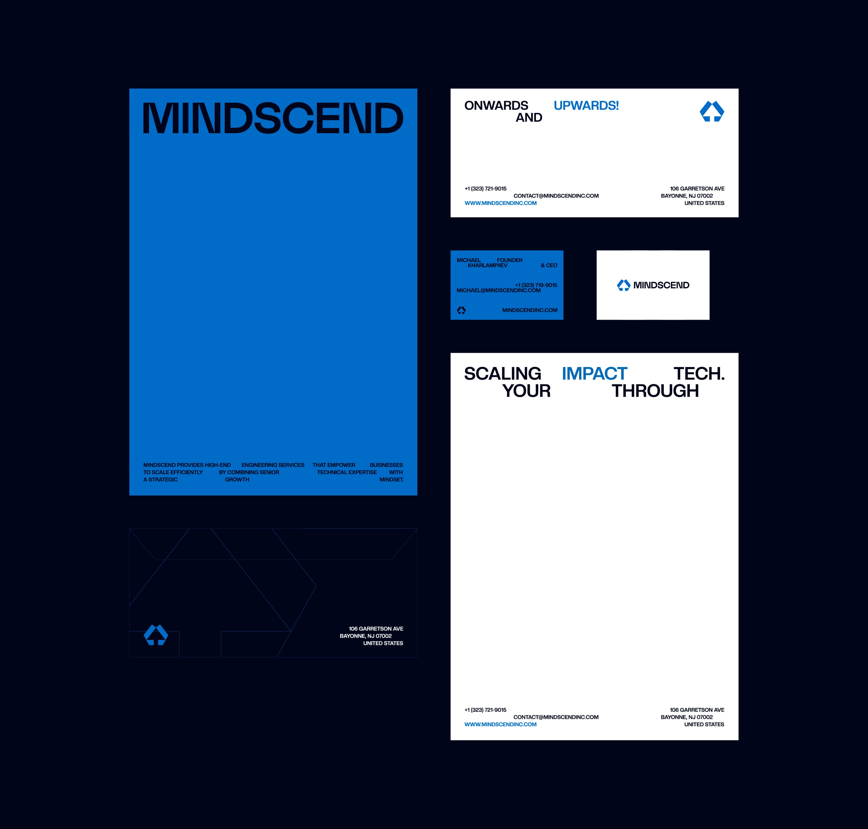
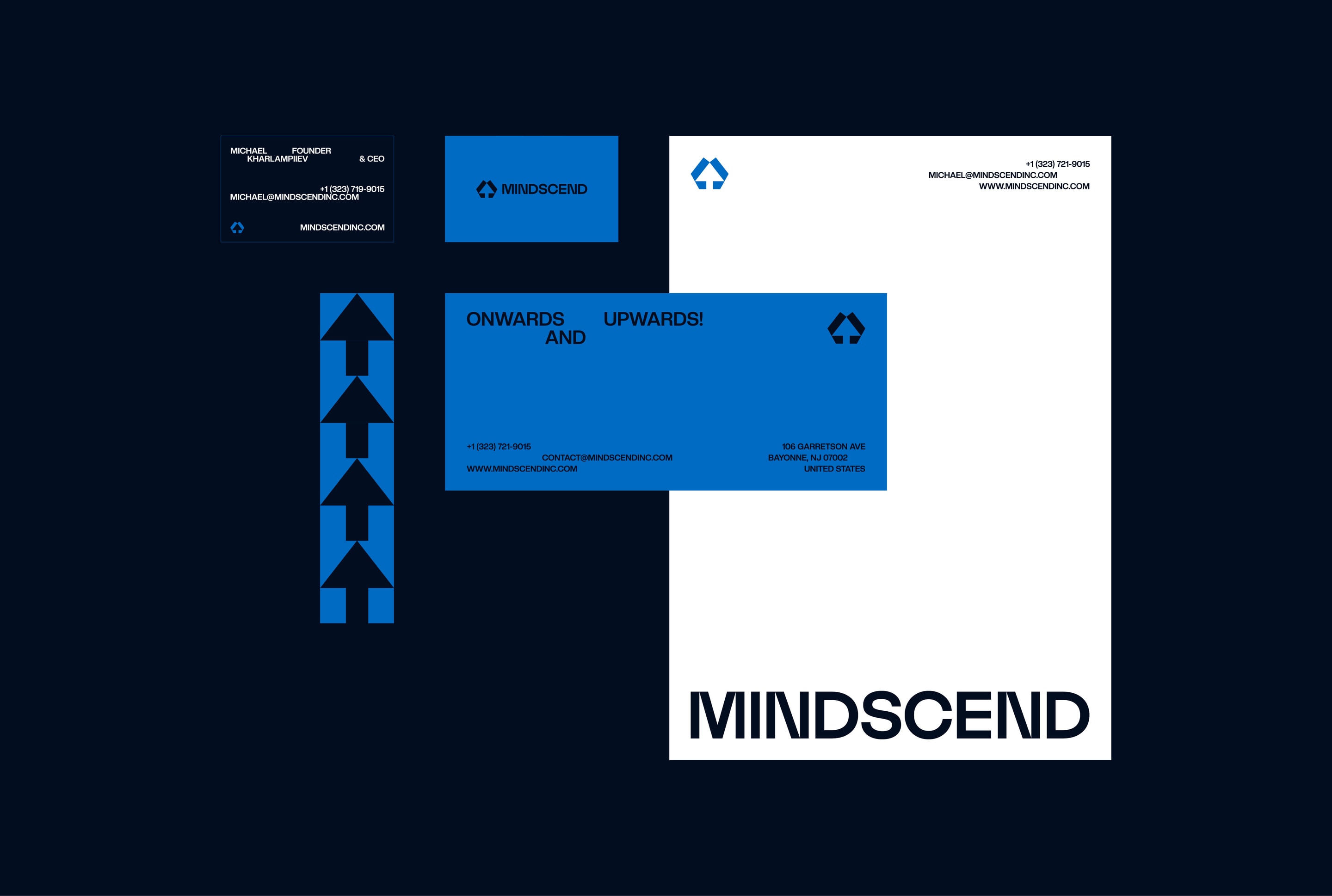
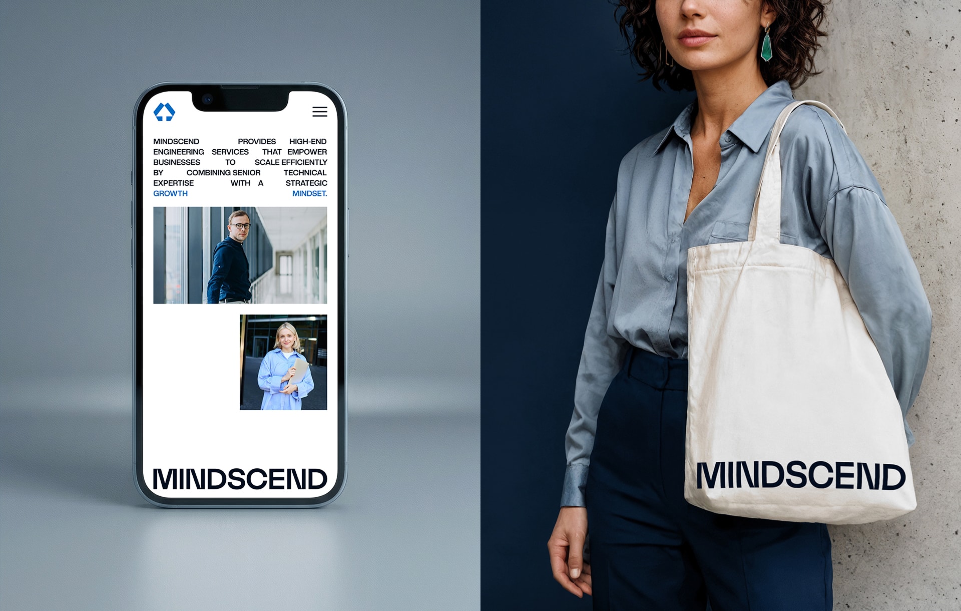
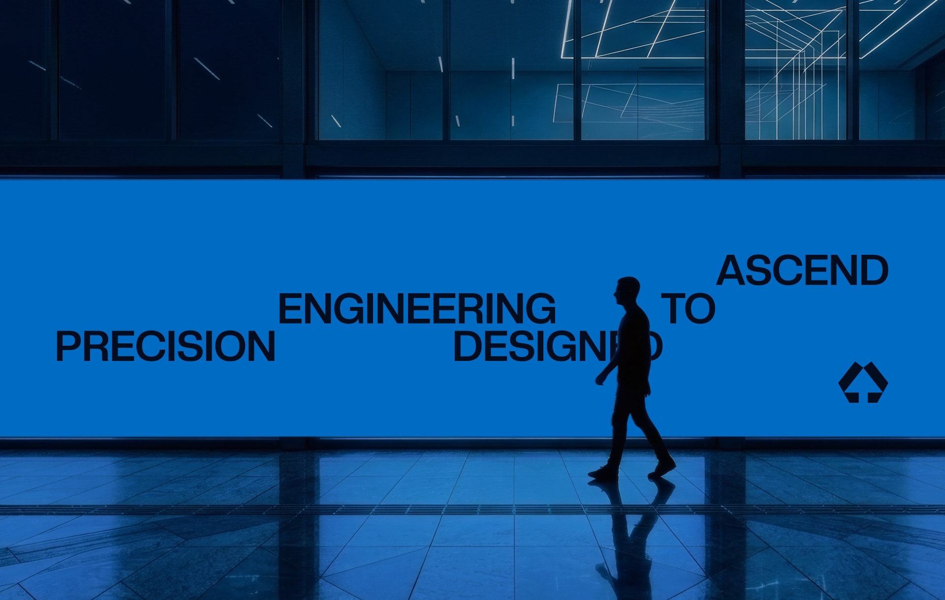
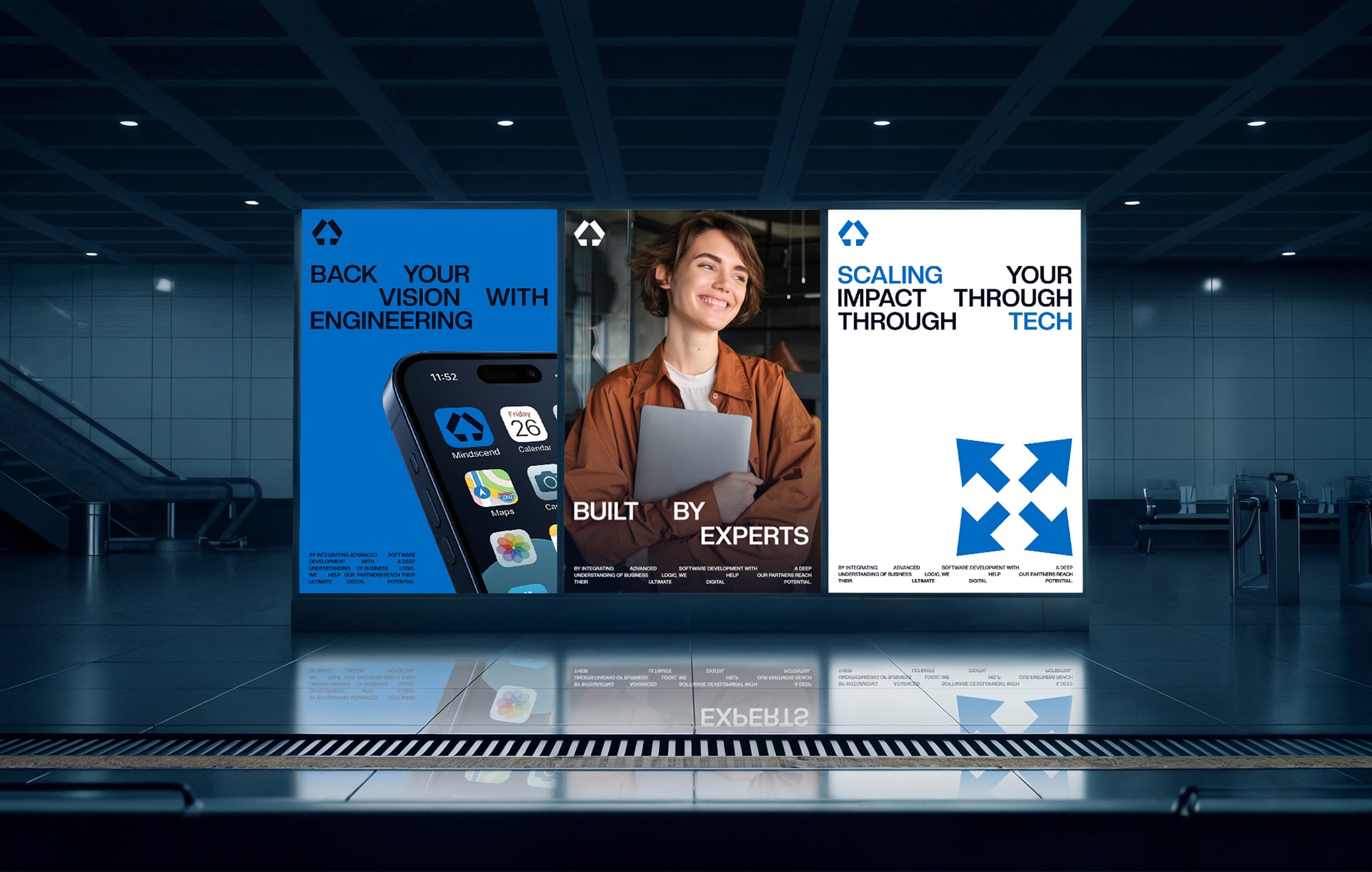
Mindscend is a high-end engineering firm dedicated to building scalable digital solutions for ambitious businesses. The name — a fusion of "Mind" and "Ascend" — reflects the company's core philosophy: intellectual growth and constant upward motion. We were tasked with developing the brand’s visual foundation — creating an identity that conveys professionalism, technological excellence, and an unrelenting drive for progress.

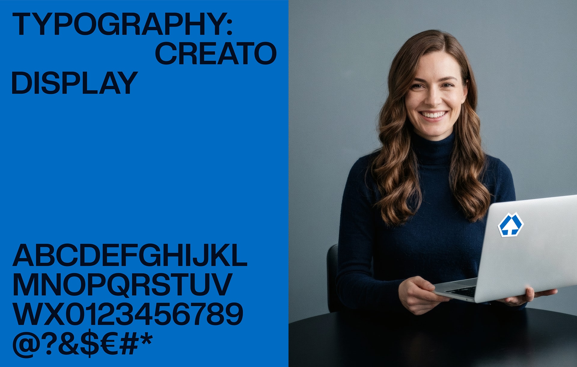
Our task was to create a cohesive branding system that would resonate with senior decision-makers. The corporate identity needed to reflect the company's ability to tackle complex technical challenges while remaining "human-centric" (Mind) and "future-oriented" (Ascend).
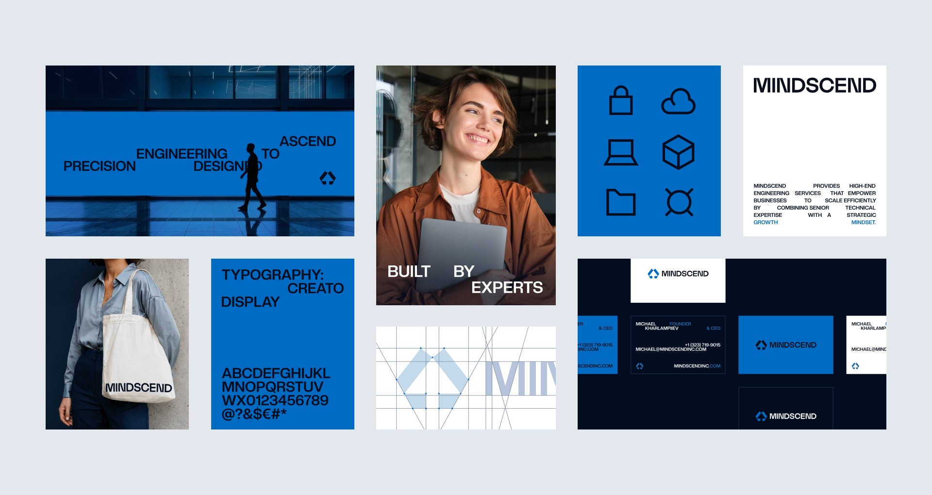
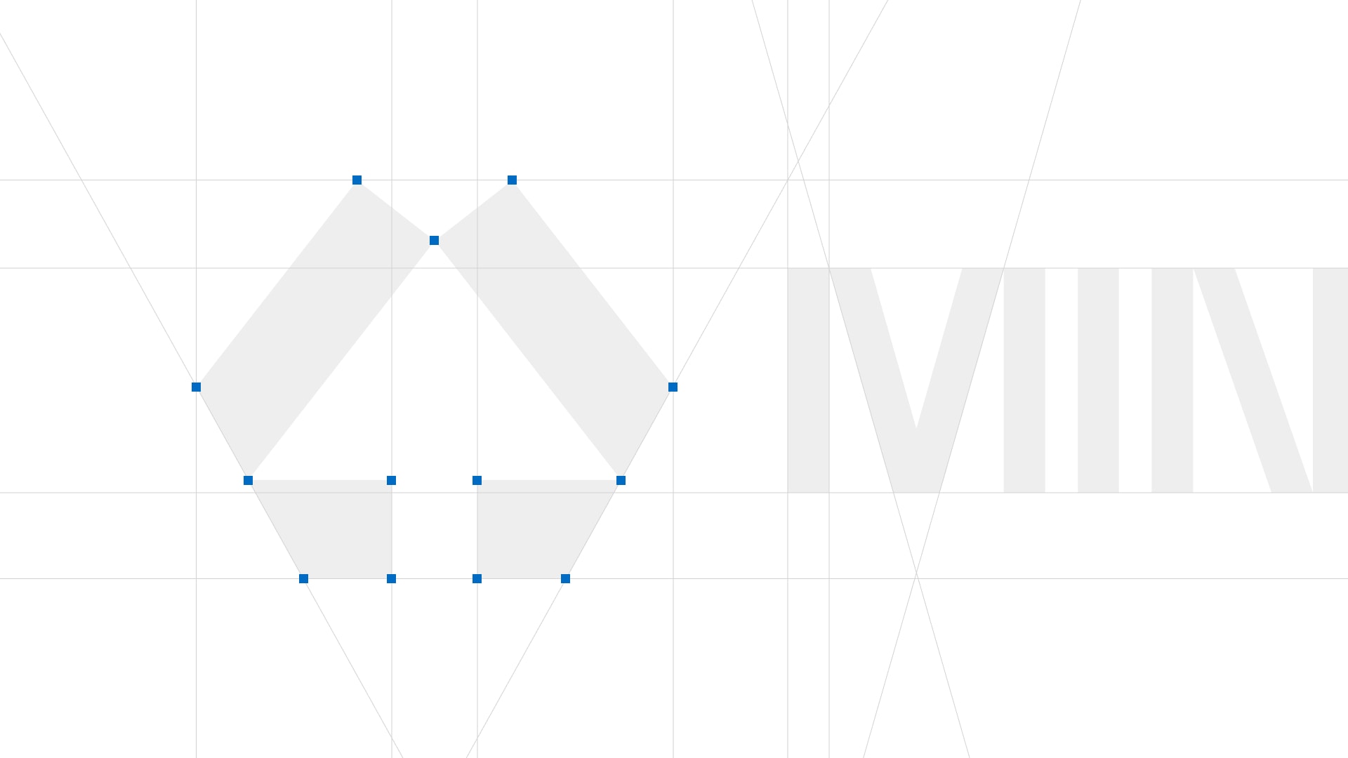
A chiseled geometric letter M integrating an upward
arrow representing continuous growth and progress.
The Mindscend logo is a precise synthesis of the company’s name and its core mission. We designed the mark to form a bold, geometric letter "M", representing the foundation of the Mind. The structure is built with clean, technical lines that evoke high-end engineering and modular architecture. Seamlessly integrated into the geometry of the "M" is an upward-pointing arrow. This element serves as a visual metaphor for the word "Ascend". It represents the momentum of growth, the direction of progress.